
Prosperi-Key (Prosperity Digital Marketplace)
Tech Startup | Desktop-Web
Project Overview:
My team of four and I redesigned the digital platform, Prosperi-Key, for tech startup Prosperity Digital Marketplace (PDM) in order to streamline onboarding and prevent user drop off.
What is Prosperi-Key?
Prosperi-Key is a digital marketplace that connects financially struggling households that are just above the poverty line with local discounts and programs. This platform was created by PDM, which is a new subsidiary of the global nonprofit, United Way.
The Challenge:
PDM discovered a high abandonment rate for
Prosperi-Key’s onboarding process, therefore investigating and fixing the causes for user dropoff were essential to increase membership.
The Solution:
A redesign of Prosperi-Key that:
-
conveys the value of becoming a member
-
simplifies the onboarding process
-
gains users’ trust that their data will be safe and confidential
Role: UX Researcher Lead & Point of Contact
Timeline: 3 weeks
Deliverables: Competitive analysis | User persona | Journey map | User flow | MoSCoW map | Sketches & Wireframes | Mid & High fidelity prototypes | Usability test reports
Tools: Figma, Miro, Google Workspace
Check out Prosperi-Key's feature in
Client Testimonial
"You guys did a great job. Your work aligns with what we suspected & we will keep your suggestions in mind.”
Kimberly Morgan, CEO of PDM

The Research Process
Industry Research
Who is ALICE? (think about the essential workers you interact with - cashiers, delivery men, etc.)
-
Working households with an income just above the Federal Poverty Level (FPL), yet struggling to afford basic living expenses - healthcare, childcare, etc.
-
Due to their income level, ALICE are ineligible for any government assistance.
-
In 2018, ALICE households made up 29% (35 million) of the U.S. population.
-
Minorities are disproportionately ALICE.


.png)
My team and I had to first learn about who Prosperi-Key was created for -- ALICE: Asset Limited, Income Constrained, Employed, a term coined by United Way.
Screener Surveys
Since Prosperi-Key was designed for ALICE, we sent out screener surveys to find users who currently fit that ALICE demographic. However, we didn’t realize the challenge of having users willingly disclose their financial hardship, and we ended up with only 2 respondents.
Pivot: How do we get more users?
- I discussed with my team the need to reach out to our personal social network to source any ALICE members.
- Also, we loosened the criteria to include those who were once a part of the ALICE population to still get that first-hand ALICE experience.
Usability Tests
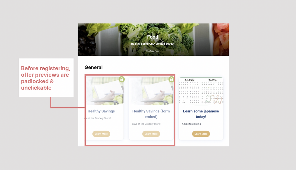
We conducted 4 usability tests on the staging site to discover any pain points:
Overall Impressions:
-
50% of users were unsure what the website had to offer based on their initial impressions


Tasks:
-
75% of users did not finish creating an account

-
100% of users did not feel confident in linking their employer for income verification

Interviews
Next, we interviewed 5 users to take a deep dive into the experiences of the low-income population with assistance programs. After affinity mapping, the key insights were:


Competitive & Comparative Analysis
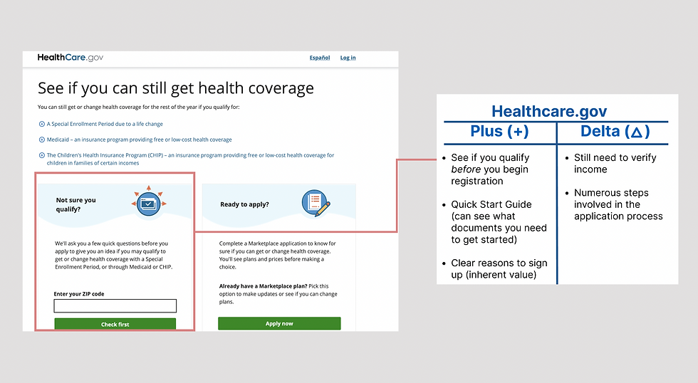
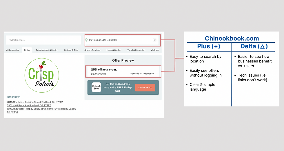
From the interviews, our users often referred to Healthcare.gov to register for low-cost health insurance and Chinookbook.com to access discounts from local businesses. We highlighted what we liked and disliked from their onboarding process and how they presented their offers.

User Persona
From our research, we created Celia, a single mom who recently got a new job as a home health aide. Despite her income, she still needs assistance from Prosperi-Key to provide for her family.

Journey Map
Here, we take a look into how Celia navigates around Prosperi-Key's website with the ultimate goal of finding offers that could help her family.

Define the Problem
As we follow Celia and her journey through Prosperi-Key, we came up a problem statement that addressed her pain points while trying to receive assistance. After several iterations, I came up with:
Celia needs to efficiently & confidently enroll into Prosperi-Key because her new income disqualifies her from other assistance programs, leaving her unable to fully provide for her family.
Ideate
From the problem statement, we created “How might we” statements so that we could start moving towards a direction for our redesign while keeping in mind Celia's pain points.
-
HMW help Celia know she’s eligible for ProsperiKey before enrolling?
-
HMW help Celia see value in ProsperiKey before enrolling?
-
HMW streamline onboarding for Celia?
-
HMW develop Celia’s trust during the onboarding process?
Design Principles
From our HMW statements, my team and I came up with 3 design principles to set as the foundation for our redesign, which are: value, transparency, and lower cognitive load. We were also able to come up with potential solutions for our MVP.


Feature Prioritization
With the design principles in mind, the MoSCoW map method helped us determine which key features were "must-haves" for our MVP. The features listed out in black in the Must, Should, Could quadrants were used in our final iteration.

User Flow
We created a user flow to map out the steps that users would encounter as they start their application process to become a Prosperi-Key member. This helped us move towards creating our MVP.

The Design Process
Prototype
With our user flow as the foundation for the MVP, we used everything that we learned from our research to create our prototype and implemented the potential solutions from our design principles into our redesign.
Value

Clear mission statement

Detailed view on the mission & ALICE

Visible & accessible offers

Clear mission statement
Transparency

Changed language & visible self-report option

Changed language & visible self-report option
Lower Cognitive Load
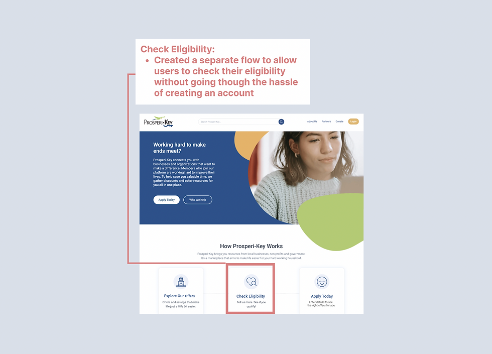
Created a separate flow

Separated the form into smaller steps & more useful breadcrumbs

Created a separate flow
Usability Test on MVP
I sourced out actual users of Prosperi-Key from our client and was able to perform 4 usability tests to determine potential pain points for our MVP. These tests gave us some insight into what worked and didn't work.
The Good


The Bad
Click here to see usability test synthesis
Iterated MVP
We knew that we had to change up the homepage message to be more clear to users about Prosperi-Key's purpose. There were also a few changes that we wanted to make that we could not get to during the first iteration that we were able to implement into this version.
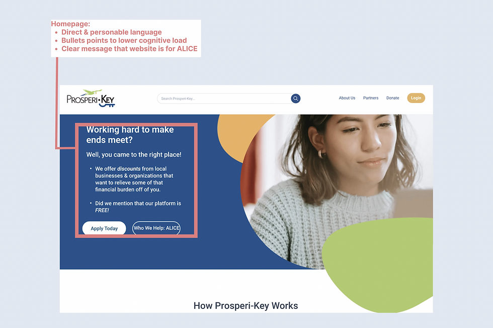
Clearer mission statement

Breadcrumbs and "Exit & Save for Later" button
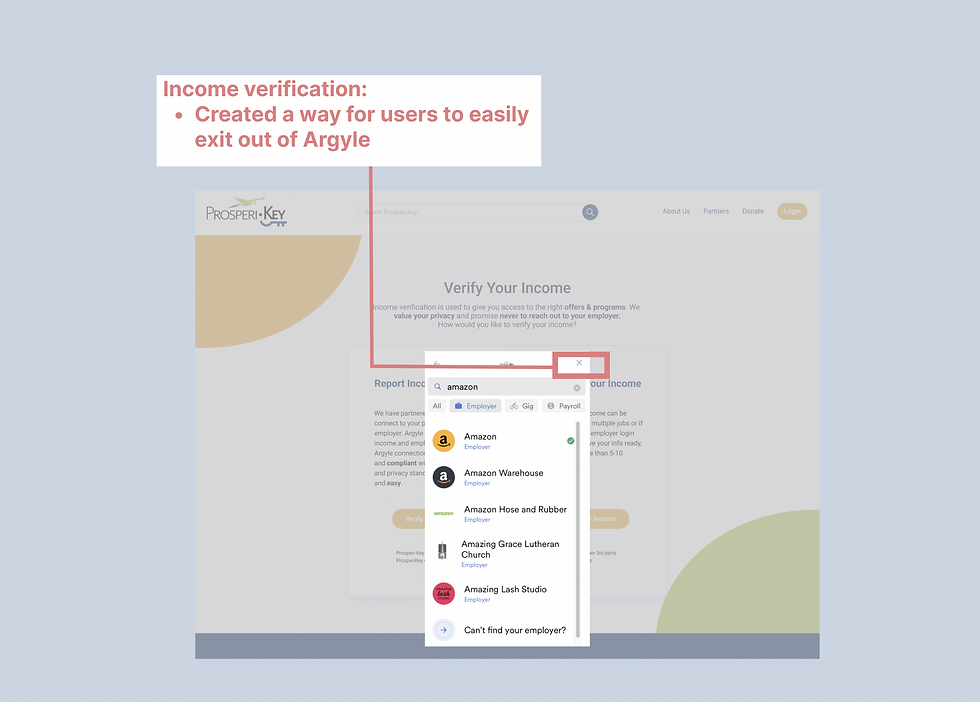
Way to exit Argyle

Clearer mission statement
Old vs. New Prosperi-Key
Our client, Prosperity Digital Marketplace was impressed with our research and design. They were particularly fond of the research insights and said that they would discuss our work with their team and told us to keep an eye out for the changes that they would make on Prosperi-Key. Upon looking at their website redesign, I saw quite a few changes that my team and I had recommended.
Here at the main highlights, where the left side screenshots are for their old website and the right side ones are for their most current, live website:
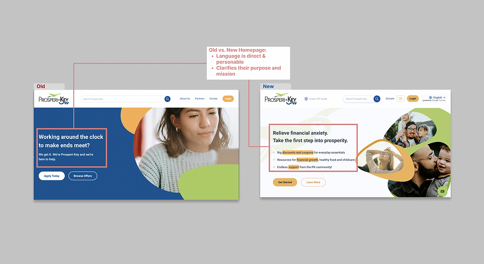
Clear mission & purpose

Changed content & less cognitive load

No padlocks & visible discounts before registration

Clear mission & purpose
Next Steps
.png)
Test out the iteration on more users.
.png)
Filter out categories based on users' locations (there are some offers shown that don't match the correct location).
.png)
Card sort the different categories of offers presented on the Offers page.
Final Thoughts
Working on a project with such a sensitive issue as financial stability brought about several challenges. First, it was difficult finding users who wanted to openly discuss their experiences with being in the low-income bracket and receiving assistance. Next, when we were able to source our users, there were other obstacles that we faced, whether it was computer literacy or simply being unable to devote sufficient time for our interviews or usability tests because of their obligations to their children.
Through our research and testing, we were able to understand the complexity of this project and hoped that our work would be insightful. In our client presentation, we emphasized the importance of value, transparency and lower cognitive load to decrease Prosperi-Key's user drop-off and increase membership. Fortunately, our work was well-received and our work proved to be useful, as there were many of our recommendations that were actually implemented onto Prosperi-Key.
I commend PDM and their hard work to relieve the financial toll that many Americans face, especially given the current state of our economy. It is extremely gratifying & rewarding to see that our hard work is making an impact to those in need.

